International Women’s Day
International Women’s Day (IWD) was first celebrated on March 19, 1911 in Austria, Denmark, Germany and Switzerland. This first IWD celebration was of course preceded by earlier events. You can read more about the history of the day at https://www.internationalwomensday.com/.
In honor of IWD I thought I’d practice a little data wrangling and graphing by following the “Visualizing the Proportion of Women in Governments Around the World” post blogged on R-Bloggers by Dylan Anderson. You too can follow along here. I’ll mostly just present the charts, and some interpretation.
Again-credit goes to Dylan Anderson for wonderful code and inspiration for most charts. I can only take credit for the top chart, and any mistakes!
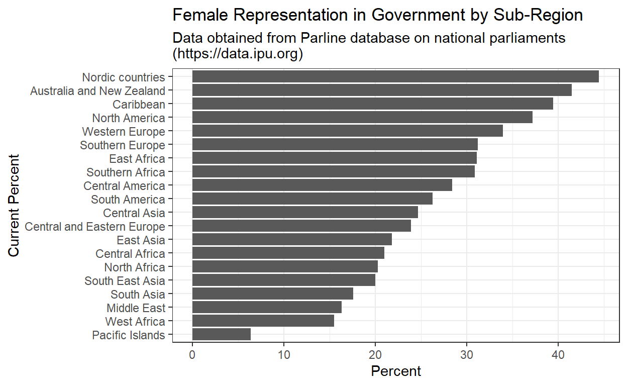
Overview-current percentage of women in sub-regional governments
Here I worked up some data obtained from Parline database on national parliaments (https://data.ipu.org). This data represents the average percentage of women in world sub-regions for 2020. Averages range from 6-45%.
Global Female Governmental Representation Over Time
Using data from the World Bank (hosted on Dylan Anderson’s Github site here) Dylan walks us through making a beautiful looking if not illustrative chart depicting change in female representation in world region governments.
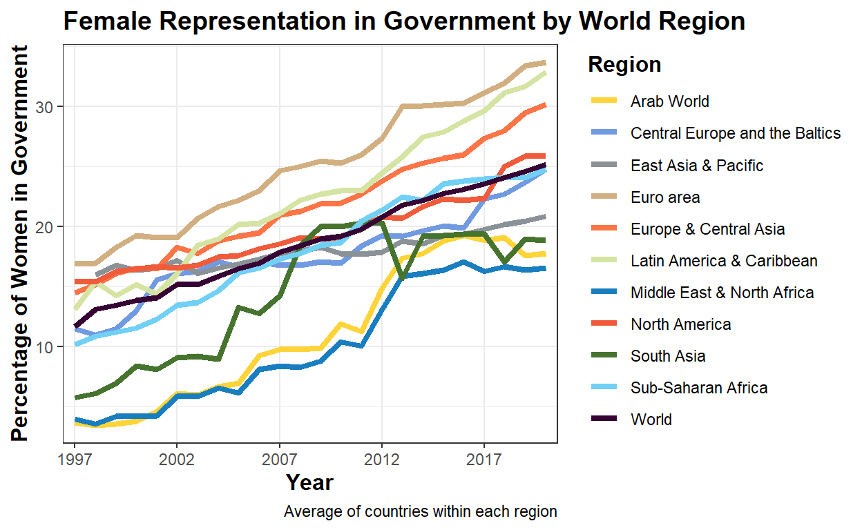
A few things jump out:
- The trend is upward, by roughly 20% globally
- The global average has increased from 12% to 25% (note the converse-men’s representation is 75% currently)
- Europe leads the way, followed by Latin America and the Caribbean.
Looking at representation by income level
In this chart we explore level of women representation in government averaged by income level. Remember, “correlation does not imply causality”, but the chart Dylan helps us create is interesting.
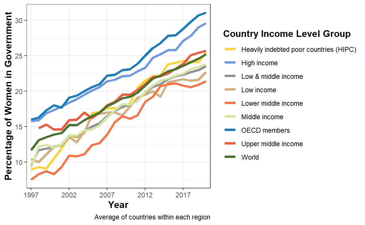
First, I had to look up OECD which is the acronym for the Organisation for Economic Co-operation and Development. From their website:
The OECD is an international organisation that works to build better policies for better lives. Our goal is to shape policies that foster prosperity, equality, opportunity and well-being for all. We draw on 60 years of experience and insights to better prepare the world of tomorrow.
I did not research enough to find out if OECD counties overlap with the other catagories-I assume they do.
Second, I did not fiddle with the colors, but did confirm that the lower “orange” line is the “Lower middle income” category, not the “Upper middle income” category.
The trends generally follow those of the chart below and beg for more research into causality.