True to the CDL’s mantra of coding, creating, and conserving, today we’re bringing you an example of work done by Conservation Data Lab member Laura Slavsky along with Randy Swaty. In the report, they took LANDFIRE Biophysical Settings (BpS) and Existing Vegetation (EVT) for the Michigamme Highlands ecoregion to explore the historical and current state of forest vegetation in the area (https://www.landfire.gov/bps.php).
This blog post will:
Briefly summarize the report & its results (the full original report can be found here or at the end of this post)
Discuss heatmaps and how to interpret them
Talk about some pros & cons of this type of data visualization, and some overall lessons learned while doing this project
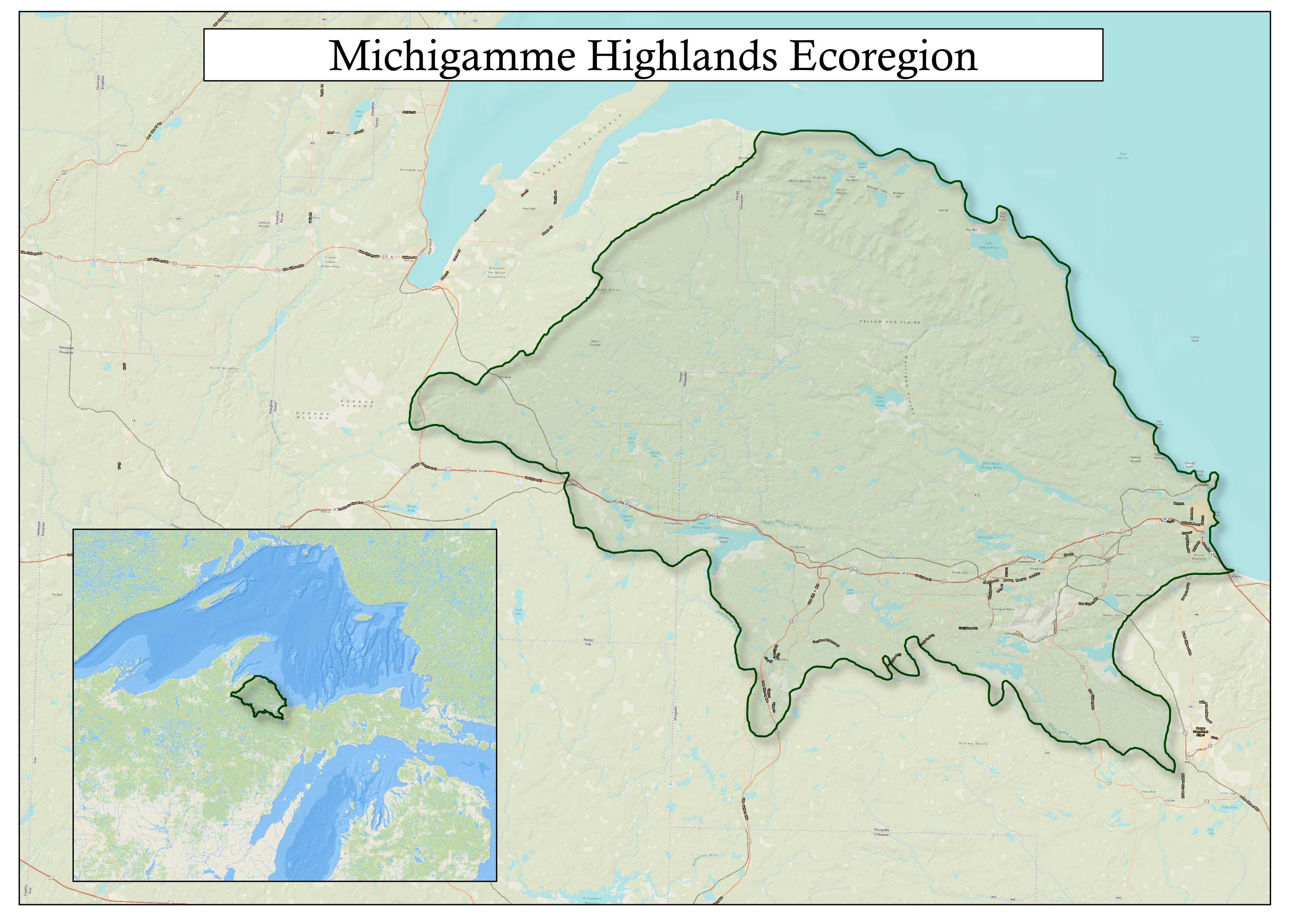
To start, let’s take a look at the geographic location this project takes place:
Overview of the Michigamme Highlands Report:
1) Background & a summary of the report:
The Michigamme Highlands Ecoregion is located in the north-central region of the Upper Peninsula of Michigan. This area is ecologically diverse, with many different forest types and water bodies throughout.
Using LANDFIRE data to investigate more about the state and health of Michigamme Highlands ecosystems, Laura and Randy created an R markdown with several interpretive graphs. They considered historical forest types, current forest types, current vegetation height & current vegetation cover in their analysis, as well as degraded lands.
From the data, they made simple bar charts of the top historical and current forest ecosystems, degraded lands, and heatmaps of current vegetation height and cover.
Results of Michigamme Highland data analysis:
In short, most of the Michigamme Highlands were historically and are today dominated by northern hardwood forest types, though today’s forests have more degradation and development such as roads are much more prevalent on the landscape. The height and cover of vegetation mostly follow regular distribution patterns, and degraded lands largely occur in areas with hardwoods with more than 70% cover.
These data, along with other resources, can help to serve as a tool for ecosystem management decisions. Again, the complete detailed report can be found here or at the end of this blog post. Section 2 describes how the heatmaps were made.
2) How we made Heatmaps
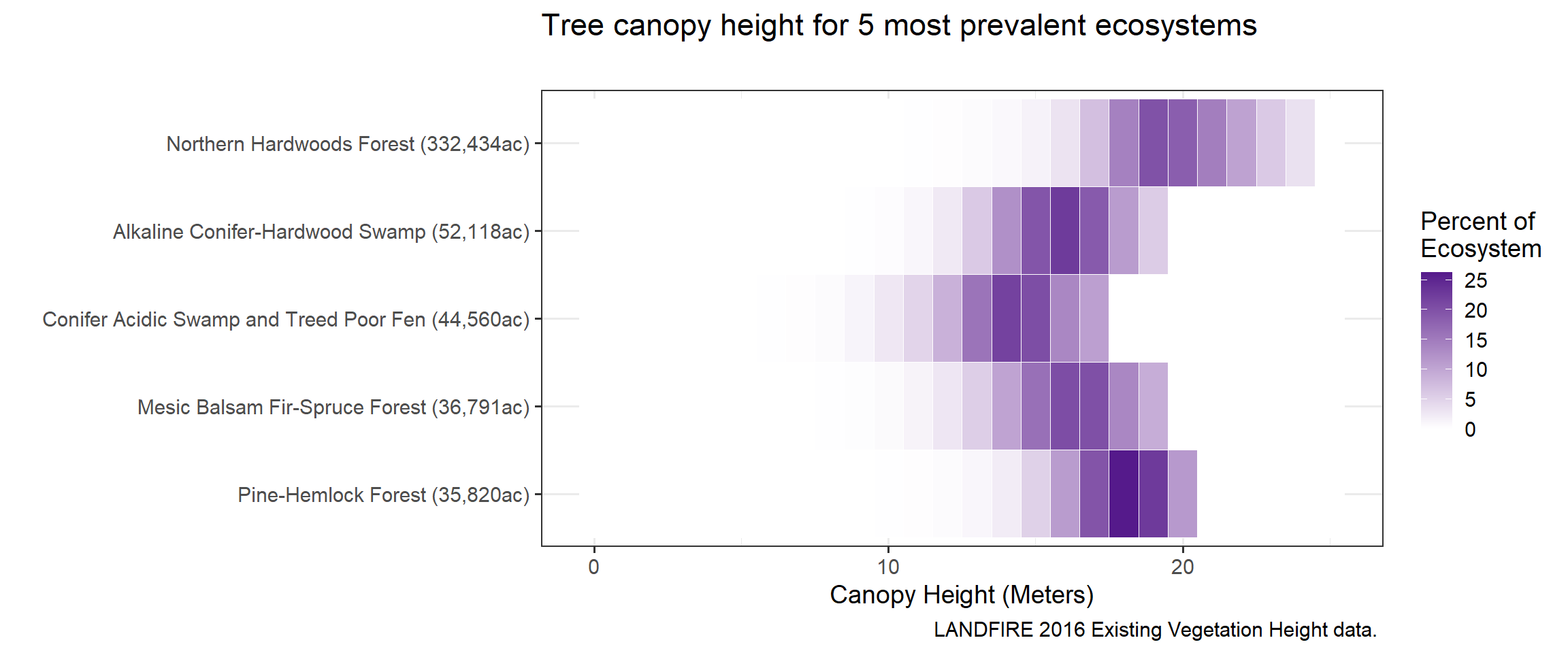
Heatmaps combine color intensity and location on the x-axis to represent data. The more intense the color/shade in the heatmap, the more prevalent that component of the map (in our report this is either cover or height). For example, a darker green bar for tree canopy indicates a higher occurrence (percentage) of that particular amount of canopy cover (the x-axis).
Each ecosystem type listed on the y-axis adds up to 100%, and the ecosystems can be compared by looking at the differences in the color intensities and where they fall on the x-axis (height or cover amount).
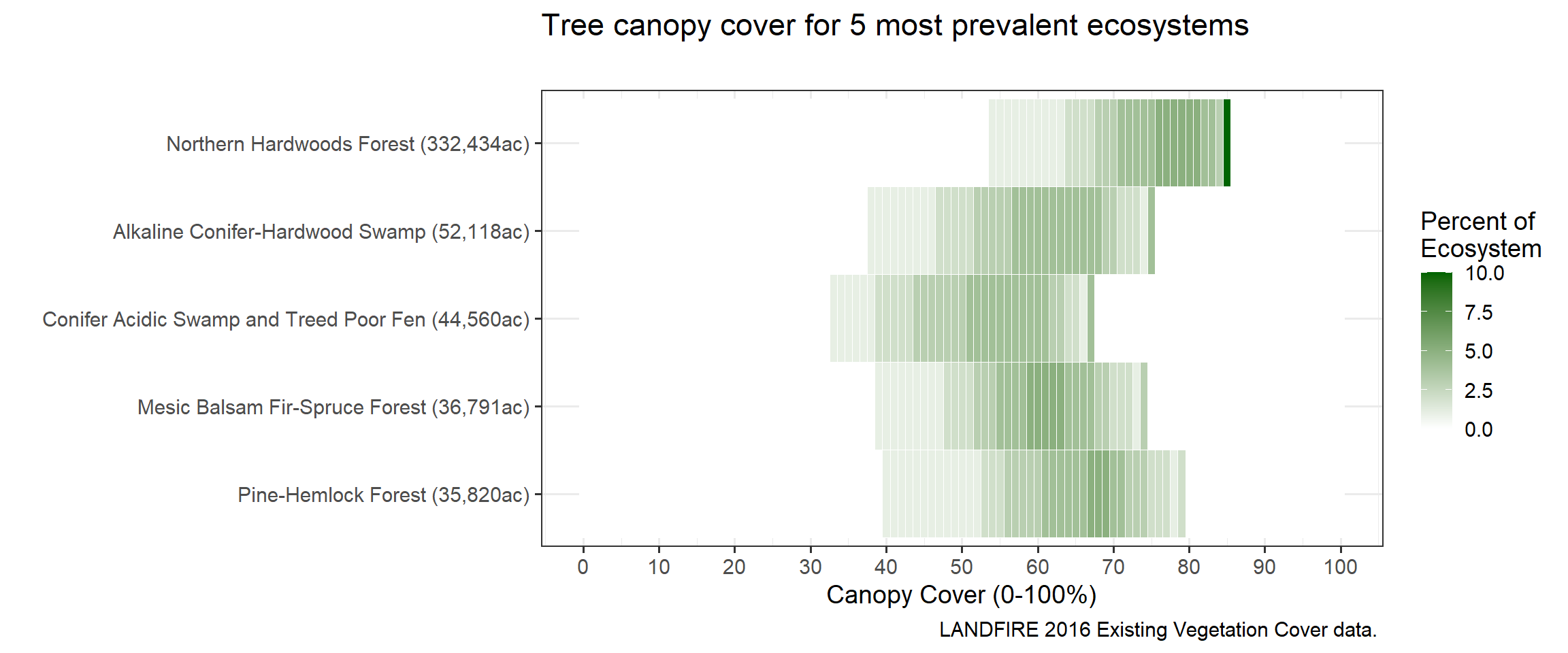
You can get the code, links and see the evolution of the heatmap here, and the input data here. Try it yourself! Note-these are rawish working files-not totally ready for public consumption. That said, the code and info is there.
3) Pros & Cons of heatmaps, & lessons learned creating this report:
Pros:
Heatmaps provide a good visualization of the existing vegetation height and cover distribution. It is beneficial to see the spread of the data and the frequency in one graph. The format of the data provides a unique way to view it, while not being overly complicated or construed unnecessarily. Heatmaps are a great tool!
Cons:
It’s possible that not every reader will intuitively know how to interpret heatmaps, which could be construed as a good thing - if encountering a new type of data visualization encourages them to slow down and figure it out. However, if they’re not motivated to do that, it can be a not-so-good thing if and they’ll just skip it, missing out on interpretation of interesting data.
Lessons learned in the creation of the Michigamme Highlands report:
Taking large amounts of data (many rows and columns of numbers and text) and making it into something meaningful is a big process that takes work. Seeing patterns and changes in data is extremely difficult without interpreting it. The goal of the Michigamme Highlands project was not to make anything extremely fancy, but rather to be a starting block to looking at the Michigamme Highlands ecosystems as a whole so that others can utilize data visualizations and gain further understanding of the Michigamme Highlands & the state of its ecosystems.
Simple graphs, maps, photos, and descriptions seemed the best fit for accomplishing this goal. From the feedback received so far, it appears that this goal has been met.
You can find the complete Michigamme Exploration document here: https://lslavsky.github.io/Michi/Exploration.html