Take home messages
- Use of LANDFIRE data, coupled with Resiliency data provided a solid start for assessing vegetation and fire conditions on the Ottawa National Forest.
- In general the northern hardwoods ecosystems have an underrepresentation of “tall, closed canopy” succession classes; the fire dependant ecosystems (e.g., the Northern Pine-Oak) have an underrepresentation of “tall, open-canopy” succession classes.
- Most of the assessment area has “Average” or “Above Average” resiliency to projected climate change.
- Next steps include developing a summary dashboard with 3-5 key messages/outputs and exploring “values” that would benefit from fire management, and ones that are high priority to protect from fire.
- Regarding the process, I like the Tufte output, and working in R-Markdown…not so sure about Shiny. See below.
The assessment can be accessed at here.
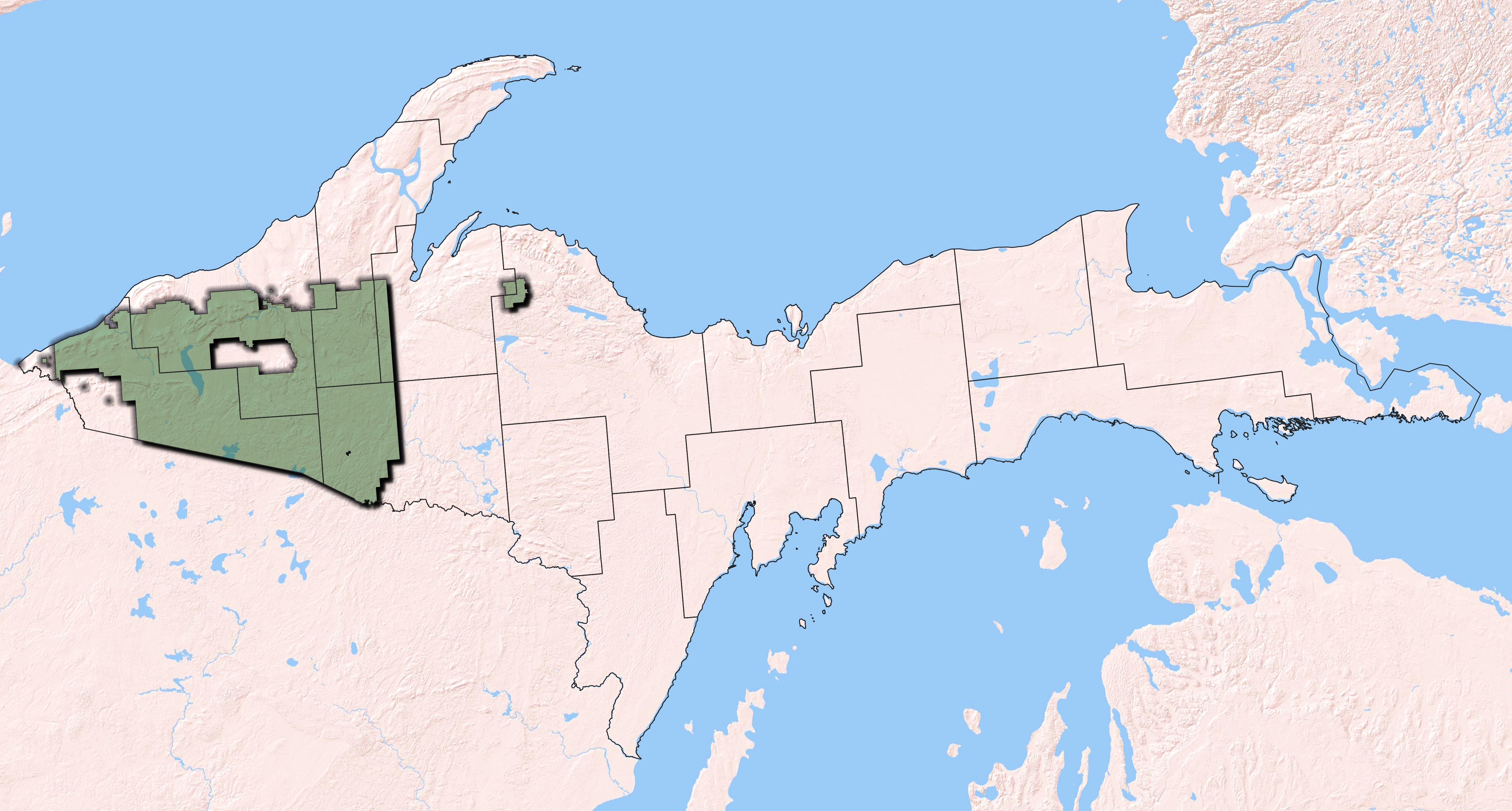
The task
For this “Rapid Assessment” I aimed to provide basic ecosystem information: which ecosystems were on the Ottawa NF historically, what is there now, what the historical fire regimes were and how historical and current ecosystem structure varies. Additionally, I wanted to try to present the information in an attractive and interactive online document.
General methods
For the assessment I used LANDFIRE datasets, including:
- Biophysical Settings-represents historical ecosystems.
- Existing Vegetation Type(https://www.landfire.gov/evt.php)-represents NatureServe’s Ecological Systems as of 2016.
- Existing Vegetation Cover-represents the vertically projected percent cover of the live canopy layer for a 30-m cell.
- Succession classes-developmental states for the EVTs based on historical structural characteristics.
- Mean Fire Return Interval-quantifies the average period between fires under the presumed historical fire regime.
Additionally, to explore climate change resiliency, I used the Resilient and Connected Landscapes data developed by The Nature Conservancy’s Eastern Conservation Science Team.
These datasets were all clipped to the Ottawa NF proclamation boundary using the “extract by mask” tool in ArcMap 10.4. To get at ecosytem condition and canopy cover per ecosystem all datasets were “combined” in ArcMap 10.4 using the combine tool in the spatial analyst toolbox.
For more detailed methods please me at rswaty@tnc.org.
The document…
was created in R-Studio as an r-markdown file with the Tufte package (which has excellent documentation that loads when you open a Tufte file!). It has R-Shiny elements (the interactive features) so is hosted on the Shiny Server.
I find that unless you have a real need for R-Shiny it’s best to avoid it. I have had many issues with deployment, and the learning curve to troubleshoot is pretty steep (at least it was for me). You can still have fun interactive charts without it using Plotly, treemap/d3treeR and sunburstR packages to name a few.
Example charts from the assessment. Code, links to data and packages.
Sunburst to explore canopy cover by ecosystems.
# load libraries
library(tidyverse)
library(treemap)
library(sunburstR)
library(readr)
library(d3r)

# read in data
evt_evc_SB <- read_csv("evt-evc-SB.csv")
head(evt_evc_SB)
# A tibble: 6 x 2
  path                                                Acres
  <chr>                                               <dbl>
1 Alkaline Hardwood Swamp-Tree Cover >= 60 and < 70%  39389
2 Alkaline Hardwood Swamp-Tree Cover >= 70 and < 80%  25140
3 Alkaline Hardwood Swamp-Tree Cover >= 50 and < 60%  17540
4 Alkaline Hardwood Swamp-Shrub Cover >= 10 and < 20% 13022
5 Alkaline Hardwood Swamp-Tree Cover >= 80 and < 90%   5999
6 Alkaline Hardwood Swamp-OTHER                        1516
# make chart
sunBurst <- sunburst(evt_evc_SB,
              legend=FALSE,
              width="100%",
              colors = list(range = RColorBrewer::brewer.pal(11, "BrBG")),
              count = TRUE


              )

sunBurstA few things to note:
- Hover over the inner ring to get percentage of each ecosystem, then move out to the outer ring to explore how the canopy cover is split out for that ecosystem
- Both rings add up to 100% of the assessment area…think on that as you explore the outer ring
- Notice the tibble. The path is essentially the ecosystem followed by the canopy cover category separated by a “-”. This was easy to set up.
Download the data to try yourself here.
Learn about the sunburstR package and find more examples here{target = ‘blank’}
Plotly chart
Here I used Plotly to make an interactive bar chart exploring resiliency categories for the assessment area.
# A tibble: 6 x 3
  VALUE  Acres Resiliency
  <dbl>  <dbl> <chr>
1  3500 61.5   Far above average
2  3498  0.222 Far above average
3  3497  0.444 Far above average
4  3494  0.222 Far above average
5  3491  0.222 Far above average
6  3490  0.222 Far above average
About this chart:
- Sorting can be a pain.
- Note the scale_x_discrete where I load in my own tick labels
- Try removing the “ggplotly” and parentheses to see what that does to the chart. Also change colors for fun!
Download the data to try yourself here.
ggplot and Plotly are covered extensivily on the web. I suggest simply searching for particular functions such as “panel.grid.major” and “ggplot” to see what you can learn.